
The Steelers colors work because they are simple, loud, and tied to Pittsburgh itself. Black and gold feel tough. They also stand out fast on helmets, jerseys, flags, and TV screens. Compared with many NFL teams, the Pittsburgh Steelers use fewer main colors, but they get more out of them.
TLDR: The Pittsburgh Steelers colors are black, gold, and white, with red, blue, and yellow inside the logo. That mix is rare because the main uniform stays clean while the logo adds extra pop. For example, if 100 fans see a black helmet with a gold stripe, a huge share will think “Steelers” before they read a name. A new fan buying gear should start with a black jersey or gold towel because those match almost everything.
Why Steelers Colors Feel So Strong
The Steelers do not need five wild uniform sets. They do not need neon trim. They do not need a helmet that changes every other week. The core idea is old school and sharp: black plus gold.
Black brings grit. Gold brings pride. White gives the uniform breathing room. That is the whole base. Easy.
This matters in the NFL. Many teams fight for attention with bright shades, chrome helmets, or alternate looks. Pittsburgh stays steady. That can sound boring. It is not. It is smart.
The Steelers look says, “We are not here to be cute.” It says hard hits, cold weather, and a fan waving a Terrible Towel like rent is due.
The Official Steelers Color Family
The main Pittsburgh Steelers colors are:
- Black — the base color. It is bold and serious.
- Gold — the accent color. It adds warmth and energy.
- White — used for numbers, road jerseys, and clean contrast.
The logo adds three more colors inside the famous star-like shapes, called hypocycloids:
- Red
- Blue
- Yellow
Those shapes came from the steel industry symbol. That is why the logo feels so local. It is not just decoration. It points back to Pittsburgh’s steel roots.
Also, the Steelers logo sits on only one side of the helmet. That is weird. In a good way. Most teams place logos on both sides. Pittsburgh keeps it on the right side only. Honestly, it feels like the kind of odd detail that should not work, but it does.
Steelers vs Raiders: Black With a Different Mood
The Las Vegas Raiders also use black. But the mood is not the same.
The Raiders pair black with silver. Their look feels cold, sharp, and outlaw-like. It has a biker jacket feel. It is sleek. It is mean.
The Steelers pair black with gold. That makes the look warmer. It feels more industrial. More blue collar. More stadium lights on a freezing night.
- Raiders: black and silver, cool and sharp.
- Steelers: black and gold, tough and proud.
Both schemes are iconic. But they send different signals within two seconds.
Steelers vs Packers: Gold, But Not the Same Feel
The Green Bay Packers use green and gold. The Steelers use black and gold. Same accent idea. Very different result.
Green Bay feels classic, friendly, and rural. Think frozen grass, small-town football, and cheeseheads. Pittsburgh feels heavier. Think steel mills, smoke, and defense making a quarterback regret his life choices.
The gold also behaves differently. On Packers gear, gold supports green. On Steelers gear, gold punches through black. That makes Pittsburgh gear feel more intense.
Steelers vs Chiefs: Gold Against Red Heat
The Kansas City Chiefs use red, gold, and white. Their red is the star. It is bright. It is loud. It feels fast.
The Steelers do the opposite. Their gold is the spark, but black is the anchor. So Kansas City feels fiery. Pittsburgh feels grounded.
This is why Chiefs games often look bright on TV. Steelers games look bold and heavy. Neither is better for everyone. They just speak different football languages.
- Chiefs colors: energetic, bright, loud.
- Steelers colors: sturdy, intense, direct.
Steelers vs Cowboys: Flash vs Force
The Dallas Cowboys use navy, silver, white, and royal blue touches. Their colors feel polished. Very clean. Very brand-friendly.
The Cowboys look like a national TV event. The Steelers look like a fourth-quarter goal-line stand.
That sounds dramatic, but color does that. Silver can feel smooth. Gold can feel rich. Black can feel powerful. Put black and gold together, and you get a uniform that feels less like a logo package and more like a warning sign.
It drives me crazy when people call Steelers gold “just yellow” on cheap merch listings. Yellow can look flat. Steelers gold needs weight. If it looks like a highlighter, something went wrong.
Steelers vs Bengals and Ravens: AFC North Color Wars
The AFC North has strong color identities. That helps the rivalries.
The Cincinnati Bengals use orange and black. Their stripes are wild. Their helmets are loud. You know it is Cincinnati right away.
The Baltimore Ravens use purple, black, gold, and white. Purple gives them a royal, darker feel. It is one of the more unique main colors in the league.
The Steelers sit between those two in an interesting way. They are not as wild as the Bengals. They are not as gothic as the Ravens. They are more stripped down. More direct.
- Bengals: animal print energy.
- Ravens: dark purple drama.
- Steelers: clean black and gold power.
Why the Terrible Towel Makes the Colors Even Bigger
The Terrible Towel is a huge part of the Steelers color story. It is usually bright gold. Fans wave it in packed stadiums. On TV, it turns the crowd into a moving gold wall.
That is a big advantage. Some teams have great uniforms but no famous matching fan item. Pittsburgh has both. The towel repeats the gold again and again. It makes the color part of the game noise.
Picture 60,000 fans waving gold towels. Even if only 70% are waving one, that is 42,000 flashes of gold in motion. That is not subtle. That is the point.
Why Steelers Gear Is Easy to Wear
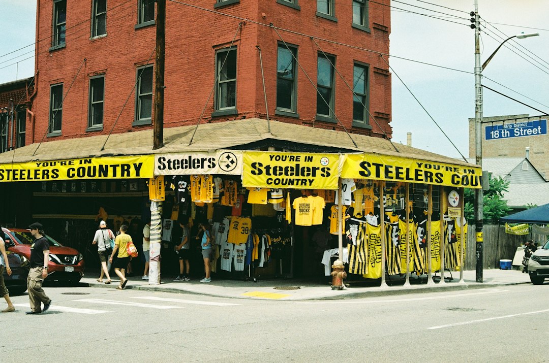
Steelers colors also win off the field. Black matches almost anything. Gold adds punch without getting too flashy. A black Steelers hoodie works with jeans, sweats, or a winter jacket.
That gives Pittsburgh an edge over teams with harder colors to style. Bright orange, teal, or purple can look amazing on game day. But for daily wear, some fans want something simpler.
Steelers gear does not ask much. Put on black. Add gold. Done.
What Other Teams Can Learn From Pittsburgh
The Steelers show that a team color scheme does not need to be complicated. It needs to be clear.
- Pick strong main colors. Pittsburgh uses black and gold with confidence.
- Keep contrast high. Gold pops hard against black.
- Connect colors to the city. The steel link gives the look meaning.
- Repeat the colors everywhere. Helmets, towels, jerseys, signs, and jackets all work together.
Some teams change too often. Fans then need a minute to process the look. Pittsburgh rarely has that problem. You spot the colors, and your brain gets it fast.
Final Whistle
The Steelers colors are not the brightest in the NFL. They are not the strangest. They are not the most modern. That is why they work so well.
Black and gold give Pittsburgh a hard, clear identity. Other NFL teams use color to show speed, flash, royalty, or tradition. The Steelers use color to show toughness and pride.
Simple wins here. And for Pittsburgh fans, simple looks pretty scary on Sunday.