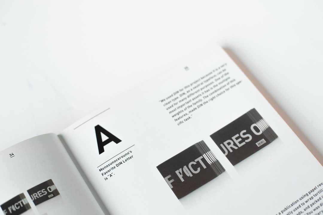
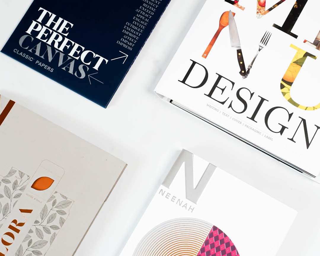
Typography is often underestimated in logo design, yet it plays a pivotal role in brand perception, memorability, and clarity. Choosing the right typeface can determine how your brand is perceived—whether it’s seen as traditional and trustworthy, modern and clean, or creative and elegant. Among the many styles of typefaces available, three dominate the landscape: Serif, Sans-serif, and Script fonts. Understanding the nuances of each can help designers and business owners make informed, strategic choices in logo development.
TLDR: Choosing the Right Typeface for Your Logo
Serif fonts convey tradition, elegance, and trustworthiness, making them ideal for formal and established brands. Sans-serif fonts present a modern, clean aesthetic and are perfect for tech, lifestyle, or minimalist brands. Script fonts add personality and sophistication, often used in luxury or creative industries. The best font type depends on your brand’s identity and the message you want to communicate visually.
Understanding Typeface Categories
Typeface categories are more than stylistic differences—they connote distinct emotional and cultural resonances. Let’s briefly define and understand the fundamental nature of these three categories:
- Serif: Typefaces with small lines or extensions at the ends of letters. Think of Times New Roman or Georgia.
- Sans-serif: ‘Sans’ means ‘without’ in French, so these typefaces lack the small lines at the ends of characters. Helvetica and Arial are classic examples.
- Script: These are stylized, flowing fonts that emulate cursive handwriting or calligraphy—like Pacifico or Great Vibes.
Each of these font families generates a specific emotional response. Selecting a typeface should never be an arbitrary choice, but rather a carefully assessed component of your visual identity.
Serif Fonts in Logo Design
Serif fonts are synonymous with tradition, authority, and reliability. They have been used in printed media for centuries, which lends them a feeling of heritage and credibility. Brands in education, finance, and legal sectors often favor serif typefaces to convey seriousness and professionalism.
Advantages of Serif Fonts in Logos:
- Create a sense of authority and tradition
- Highly legible in print formats
- Associated with established and well-grounded brands
Examples of brands using Serif fonts: The New York Times, Vogue, and Time Magazine—all of which consciously communicate trust, depth, and tradition through their typography.

However, one must be cautious. Overuse or poor implementation can make a logo look dated or inaccessible to younger audiences who often prefer cleaner, more modern aesthetics. Serif logos must be paired with contemporary elements or well-thought-out space and color treatments to avoid visual fatigue or conveying obsolescence.
Sans-serif Fonts in Logo Design
Sans-serif fonts offer clarity, modernism, and minimalism. This typeface category has become the default for many highly visible digital platforms. Its simplicity allows for easy scaling and readability, making it ideal for logos that exist across multiple screen sizes and resolutions.
Advantages of Sans-serif Fonts in Logos:
- Highly legible onscreen and in small sizes
- Communicates openness, simplicity, and accessibility
- Versatile across various industries and sectors
A few familiar examples include Google, Facebook (now Meta), and Spotify. These brands harness sans-serif fonts to reflect innovation, cleanliness, and forward-thinking values. Especially in the tech world, sans-serif logotypes dominate due to their clarity and adaptability.

When using sans-serif fonts, however, there is a risk of becoming overly generic or sterile. Too many brands cling to this safe option, which can dilute uniqueness unless paired with other distinctive design elements—like unique letter spacing, custom characters, or bold color schemes.
Script Fonts in Logo Design
Script fonts introduce flair, elegance, and a human touch. These fonts mimic handwriting and often evoke emotion and intimacy. Brands that require a touch of personality, such as those in fashion, beauty, or artisan products, often employ script fonts to enhance the aesthetic appeal of their logos.
Advantages of Script Fonts in Logos:
- Create emotional resonance and memorability
- Convey creativity, elegance, and sophistication
- Ideal for luxury or niche brands with personalized identities
Brands such as Coca-Cola, Cadillac, and Instagram have successfully implemented script fonts to create logos that are instantly recognizable and emotionally gripping. The flowing curves help create a sense of intimacy and imagination, drawing consumers closer to the brand ethos.
However, script fonts can pose significant design challenges. They are often less legible at small sizes and can become overly ornate if not handled with care. Their use demands high-quality design execution to avoid appearing amateurish.
Image not found in postmetaHow to Choose the Right Font Type for Your Logo
Choosing between serif, sans-serif, and script fonts depends on your brand values, target audience, and usage demands. This decision should align with your brand story and purpose while allowing flexibility across various applications, from business cards to mobile icons.
Some decision-making criteria include:
- Your Industry: Conservative sectors often favor serif fonts, while modern sectors prefer sans-serif. Creative industries lean into script fonts.
- Brand Personality: Is your brand formal? Traditional? Youthful? Your typeface should be an extension of these traits.
- Medium: Logos increasingly need to perform on digital screens. Sans-serif fonts generally offer the best readability in digital environments.
- Uniqueness: Custom typeface alterations or creative pairings (e.g., serif headline with sans-serif subtext) can elevate even the simplest font selections.
Combining Fonts for Depth
While many successful logos use a single typeface, combining fonts can result in a layered and multidimensional design. For instance, using a serif for a brand name and a sans-serif for a tagline can simultaneously convey tradition and modernity. Similarly, script typography can be paired with a sans-serif subheading to ensure legibility while injecting style.
Effective font pairing requires:
- Contrast: Choose fonts with enough visual difference to create hierarchy and interest.
- Harmony: Despite contrast, the fonts must share some consistent visual cues (line weight, spacing, etc.)
- Readability: Always test combinations in various sizes and formats to ensure clarity.
An example might be a fashion brand that uses a stylized script font for its name while employing a modern sans-serif for product descriptors or web navigation. This method helps maintain aesthetic charm without sacrificing function.
Conclusion
Typography plays an instrumental role in logo design, shaping how a brand is perceived before a single word is read. Whether you gravitate toward the tradition-steeped elegance of serifs, the clean professionalism of sans-serif, or the artistic flair of script typefaces, your decision must match your brand’s message and consumer expectations.
In a marketplace where visual identity can define success and longevity, typeface choice should never be a last-minute decision. It is essential to view typography not just as a visual component, but as a storytelling tool—one that, when used expertly, speaks volumes more than a brand name alone ever could.
